
Sum of divisor powers

The function σk takes an integer n and returns the sum of the kth powers of divisors of n. For example, the divisors of 14 are 1, 2, 4, 7, and 14. If we set k = 3 we get

σ3(n) = 1³ + 2³ + 4³ + 7³ + 14³ = 3096.

A couple special cases may use different notation.

  • σ1(n) is the sum of the divisors of n and the function is usually written σ(n) with no subscript.

In Python you can compute σk(n) using divisor_sigma from SymPy. You can get a list of the divisors of n using the function divisors, so the bit of code below illustrates that divisor_sigma computes what it’s supposed to compute.

    n, k = 365, 4
    a = divisor_sigma(n, k)
    b = sum(d**k for d in divisors(n))
    assert(a == b)

The Wikipedia article on σk gives graphs for k = 1, 2, and 3 and these graphs imply that σk gets smoother as k increases. Here is a similar graph to those in the article.

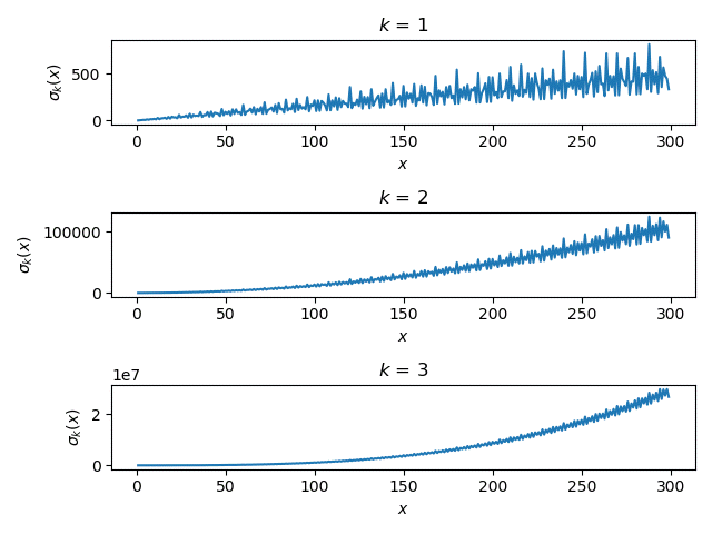
The plots definitely get smoother as k increases, but the plots are not on the same vertical scale. In order to make the plots more comparable, let’s look at the kth root of σk(n). This amounts to taking the Lebesgue k norm of the divisors of n.

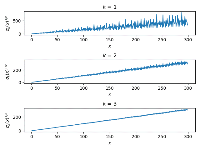
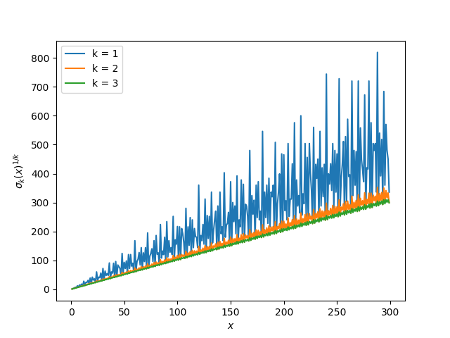
Now that the curves are on a more similar scale, let’s plot them all on a single plot rather than in three subplots.

If we leave out k = 1 and add k = 4, we get a similar plot.

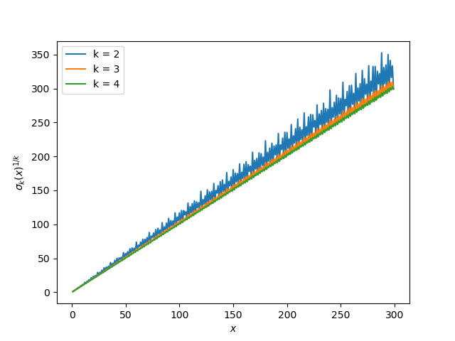
The plot for k = 2 that looked smooth compared to k = 1 now looks rough compared to k = 3 and 4.

The post Sum of divisor powers first appeared on John D. Cook.


from John D. Cook https://ift.tt/2QEhFy2
via IFTTT

Comments

Popular posts from this blog

Using RStudio and LaTeX

(This article was first published on r – Experimental Behaviour , and kindly contributed to R-bloggers) This post will explain how to integrate RStudio and LaTeX, especially the inclusion of well-formatted tables and nice-looking graphs and figures produced in RStudio and imported to LaTeX. To follow along you will need RStudio, MS Excel and LaTeX. Using tikzdevice to insert R Graphs into LaTeX I am a very visual thinker. If I want to understand a concept I usually and subconsciously try to visualise it. Therefore, more my PhD I tried to transport a lot of empirical insights by means of  visualization . These range from histograms, or violin plots to show distributions, over bargraphs including error bars to compare means, to interaction- or conditional effects of regression models. For quite a while it was very tedious to include such graphs in LaTeX documents. I tried several ways, like saving them as pdf and then including them in LaTeX as pdf, or any other file ...

Explaining models with Triplot, part 1

[This article was first published on R in ResponsibleML on Medium , and kindly contributed to R-bloggers ]. (You can report issue about the content on this page here ) Want to share your content on R-bloggers? click here if you have a blog, or here if you don't. Explaining models with triplot, part 1 tl;dr Explaining black box models built on correlated features may prove difficult and provide misleading results. R package triplot , part of the DrWhy.AI project, is aiming at facilitating the process of explaining the importance of the whole group of variables, thus solving the problem of correlated features. Calculating the importance of explanatory variables is one of the main tasks of explainable artificial intelligence (XAI). There are a lot of tools at our disposal that helps us with that, like Feature Importance or Shapley values, to name a few. All these methods calculate individual feature importance for each variable separately. The problem arises when features used ...