Elliott writes:
I think we’re onto something with the low between-state correlations [see item 1 of our earlier post]. Someone sent me this collage of maps from Nate’s model that show:
– Biden winning every state except NJ
– Biden winning LA and MS but not MI and WI
– Biden losing OR but winning WI, PAAnd someone says that in the 538 simulations where Trump wins CA, he only has a 60% chance of winning the elec overall.
Seems like the arrows are pointing to a very weird covariance structure.

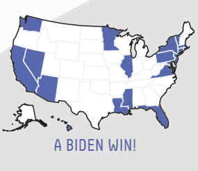


I agree that these maps look really implausible for 2020. How’s Biden gonna win Idaho, Wyoming, Alabama, etc. . . . but not New Jersey?
But this does all seem consistent with correlations of uncertainties between states that are too low.
Perhaps this is a byproduct of Fivethirtyeight relying too strongly on state polls and not fully making use of the information from national polls and from the relative positions of the states in previous elections.
If you think of the goal as forecasting the election outcome (by way of vote intentions; see item 4 in the above-linked post), then state polls are just one of many sources of information. But if you start by aggregating state polls, and then try to hack your way into a national election forecast, then you can run into all sorts of problems. The issue here is that the between-state correlation is mostly not coming from the polling process at all; it’s coming from uncertainty in public opinion changes among states. So you need some underlying statistical model of opinion swings in the 50 states, or else you need to hack in a correlation just right. I don’t think we did this perfectly either! But I can see how the Fivethirtyeight team could’ve not even realized the difficulty of this problem, if they were too focused on creating simulations based on state polls without thinking about the larger forecasting problem.
There’s a Bayesian point here, which is that correlation in the prior induces correlation in the posterior, even if there’s no correlation in the likelihood.
And, as we discussed earlier, if your between-state correlations are too low, and at the same time you’re aiming for a realistic uncertainty in the national level, then you’re gonna end up with too much uncertainty for each individual state.
At some level, the Fivethirtyeight team must realize this—earlier this year, Nate Silver wrote that correlated errors are “where often *most* of the work is in modeling if you want your models to remotely resemble real-world conditions”—but recognizing the general principle is not the same thing as doing something reasonable in a live application.
These things happen
Again, assuming the above maps actually reflect the Fivethirtyeight forecast and they’re not just some sort of computer glitch, this does not mean that what they’re doing at that website is useless, nor does it mean that we’re “right” and they’re “wrong” in whatever other disagreements we might have (although I’m standing fast on the Carmelo Anthony thing). Everybody makes mistakes! We made mistakes in our forecast too (see item 3 in our earlier post)! Multivariate forecasting is harder than it looks. In our case, it helped that we had a team of 3 people staring at our model, but of course that didn’t stop us from making our mistakes the first time.
At the very least, maybe this will remind us all that knowing that a forecast is based on 40,000 simulations or 40,000,000 simulations or 40,000,000,000 simulations doesn’t really tell us anything until we know how the simulations are produced.
from Statistical Modeling, Causal Inference, and Social Science https://ift.tt/3lCAwYE
via IFTTT
Comments
Post a Comment