Editor’s Note: The Atlantic is making vital coverage of the coronavirus available to all readers. Find the collection here.
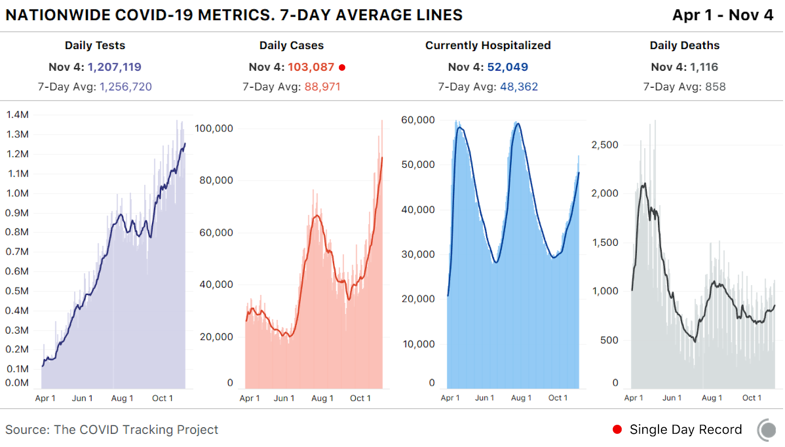
The United States reported 103,087 cases of COVID-19 today, the highest single-day total on record, according to the COVID Tracking Project at The Atlantic. It marks the first time that the country—or any country in the world, for that matter—has documented more than 100,000 new cases in one day.
At the same time, states reported that more than 52,000 people are hospitalized with the coronavirus, the highest level since early August. The number of people hospitalized nationwide is increasing faster in November than it did in October, and—over the past 10 days—their ranks have risen by about 1,000 people a day.
The record officially marks what was already clear: As winter nears, the country’s third surge of infection is dangerously accelerating in almost every region of the country. This is the reality that the United States is facing, regardless of who will become its next chief executive: A deadly respiratory pandemic is spiraling out of control, and the number of hospitalized people—and deaths—is certain to rise over the next several months.
The unhappy milestone has been months in the making. On the final day of June, as states in the South and Southwest brimmed with infection, Anthony Fauci, the nation’s top infectious-disease expert, warned that the U.S. could soon see a 100,000-case day. His prediction came several months early. Three weeks later, the country’s summertime surge peaked at about 75,000 cases in one day. But that count likely fell far short of actual infections: In the hardest-hit states, such as Arizona, tests were so scarce that symptomatic doctors could not even test themselves.
By early September, the pandemic faded to its lowest level since June, with the country reporting only about 34,000 cases a day. Experts warned that the winter months could prove catastrophic, but President Trump took a victory lap. The country was “rounding the final turn” on the pandemic, he announced at a Pennsylvania rally on September 3, a line he echoed at the White House a week later.
In fact, the country was already riding a third wave of infection. By then, cases and hospitalizations were rising in the upper Midwest and Great Plains; North Dakota and Wisconsin busted through their all-time records. Then the Mountain West exploded, and Utah, Montana, and Idaho set new records. Then finally the Northeast, which had been lacerated in the spring, saw cases tick up.
Now the country has reached the 100,000 mark that Fauci predicted. Today, 34 states reported more than 1,000 new cases apiece, forming a single belt of infection from Massachusetts to Nevada. Sixteen states saw a record number of their residents hospitalized with the virus. More than 47,000 Americans have died since Trump’s Pennsylvania rally two months ago.
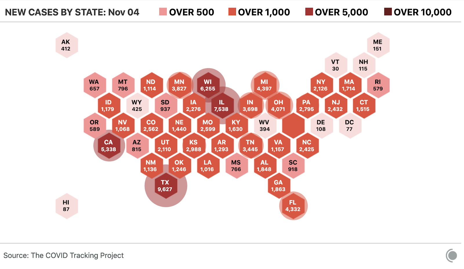
Today’s six-figure record reflects high levels of infection across the country, including in some of the most populous states. Texas reported 9,600 new cases, with nearly a third coming from El Paso, where hospitals are above capacity. Indiana has set a single-day record with 3,698 new cases. Illinois recorded 7,500 new cases, and its number of hospitalizations increased.
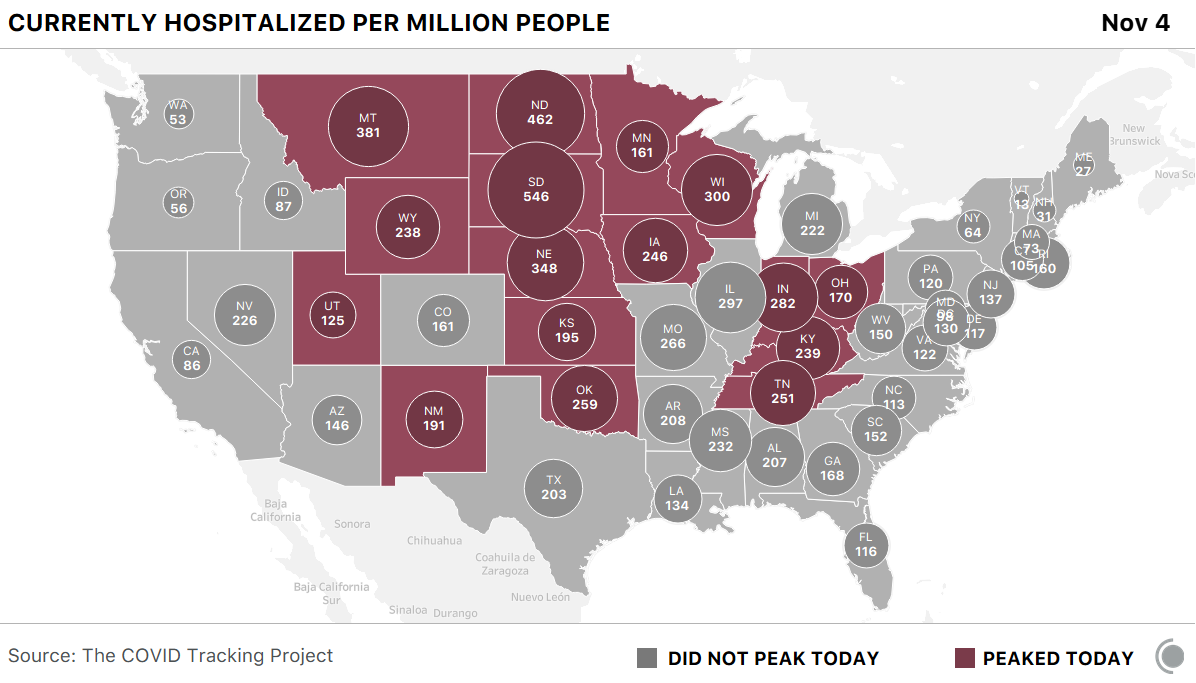
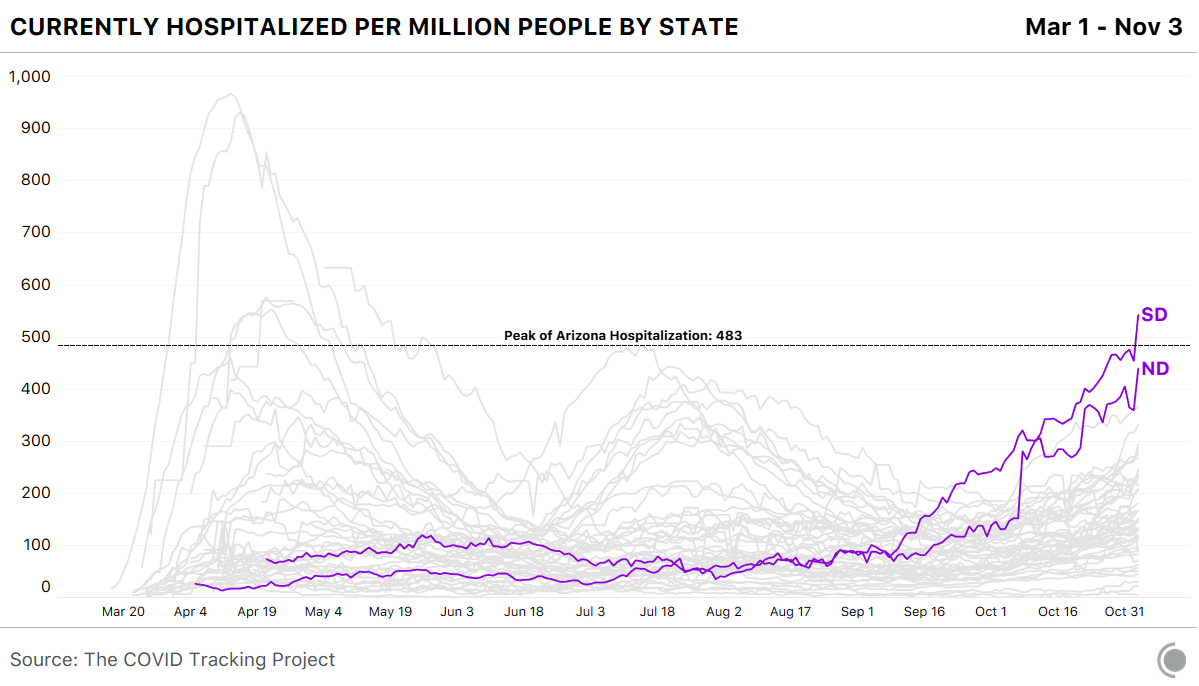
In addition, South Dakota reported—and North Dakota will likely soon report—more hospitalizations per capita than Arizona saw in its summertime surge.
No matter who wins the presidential election, it is virtually guaranteed that the next several months will be among the darkest of the pandemic. Hospitalizations are virtually certain to rise, and cases could spread further if Americans travel for Thanksgiving. And even if a vaccine were to be approved this month, it would likely not be deployed widely enough to bestow protective immunity for most at-risk Americans until well into the new year, Scott Gottlieb, who led the Food and Drug Administration from 2017 to 2019, has said.
The next president will take power in a country where 100,000 cases forms a new baseline. It is November 4, 2020, and the United States is not a healthy country.
Comments
Post a Comment